
Results
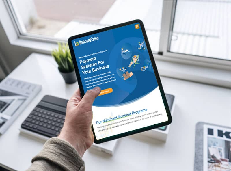
The owner of Bancard Sales was very happy with the results of his new modern website which uses custom graphics and animations to make it look more interactive.
With the new design Bancard Sales will definitely improved its lead generation and conversion rate.
Using their Brand Guidelines all throughout the website makes it more professional and trustworthy to its audience. Where they deal with businesses and payments, it is vital to get there audience’s trust and show authenticity through a clean and corporate design but using illustrations adds a fun approach to its personality.
The new website not only shows what Bancard Sales can do for its clients but also tells a story of how they can help them through their payment system services and products.

The Challenge
The old website of Bancard Sales was old, outdated and boring in which they don’t use an exact guideline for their design such as typography, colors and graphics usage.
Most of their pages had a one to two column layout and was hard to read that sometimes use too much shadows and random colors.
Without any cohesiveness and an exact story to tell the audience their old website’s design was more of a forgotten brochure that has been left decades ago.
When it comes to being in the IT industry specially in the Electronic Payments space, authenticity and trustworthiness is a very important factor that needs to be considered in the design of a website.
To achieve this you would need an up-to-date modern layout that not only uses the Brand’s Identity through its colors, typography, graphics and content but also tells a clear and concise arrangement of all the sections to create a fluid presentation of the services and products offered.
“John and the Ironclad Team took my vision for my business and created a website that not only serves its purpose but also gives my audience a fun and enticing way to browse through any page with ease and understand what they are being offered. ”

Our strategy
We sent him some links of sample websites that he might consider as inspiration for the new website’s design and direction.
In a few hours we knew what exactly he was looking for and told him about our strategy for his new website. Brian agreed and was excited to get started thus, we booked another call and signed him up to our Custom Web and Graphic Design packages including SVG animations.
By the end of the week we had a homepage and one inner page for him to review and everything else was history!
Tools We UseD


Corporate Colour Palette
Using clean, bright and crisp business colors to show security and safety throughout the interface.
#1367a7
#27aae1
#f99e2c
#96ca50
#FFFFFF
Clean Typography
Aa
Roboto Regular 36pt
Roboto Regular 24pt
Roboto Regular 20pt
“A clean typography makes it easier for the audience to read the text without squinting. “
Aa
Roboto Regular 32pt
Roboto Regular 24pt
Roboto Regular 18pt
“This will not only allow them to understand what the product is all about but also be more comfortable for them to read.”
Not Convinced?
We do a plethora of Branding and Online Marketing Services for our clients. Check them out!


